Key Capabilities
- Web-based form creation with drag-and-drop designer
- Support for sections, detail tables, and multiple field types
- User authentication and access control for form submissions
- Dynamic form generation with customizable branding and success messages
Overview
Forms are created on the connector Form Designer tab. A form is divided into sections and detail tables, each of which can have a variable number of fields. For details, see Creating Forms. When you use a Form connector to submit new data, you should place the connector at the start of a connected flow. Clients can connect to the web endpoint, view and fill out the form, and submit this data into the configured flow. For more information, see Submitting Form Data. The following sections explain how to configure the connector, create forms, and submit new form data.Connector Configuration
This section contains all of the configurable connector properties.Form Designer Tab
Settings related to building a set of form fields that are organized into sections and detail tables.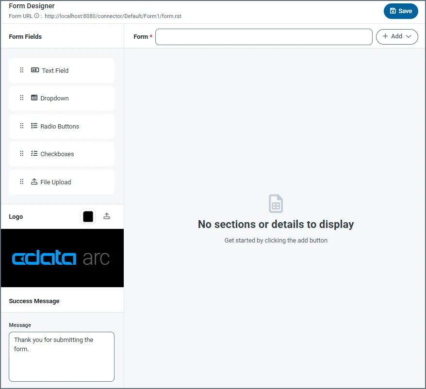
| Setting | Description |
|---|---|
| Form URL | A link to the published form. |
| Form | Title of the form (for example, your company name). |
| Add | Dropdown to add a section or a detail table. Add Section lets you add specific sections to a form, and Add Detail lets you add a detail table to the form. Detail tables act like a pre-configured table where the form user can add as many records as they need for the dataset. |
| Form Fields | Drag and drop fields into detail table and section areas of the form. Repeat this as many times as necessary. The field types are: Text Field — An input text box with a name and description. Dropdown — A dropdown list with name and dropdown options. Radio Buttons — A set of radio buttons with name and radio button options. Checkboxes — A set of checkboxes with name and checkbox options. File Upload — Allows form users to upload specific file types directly to the form. |
| Logo | Upload your company logo, which appears at the top of the form. By default it uses the logo. You can also change the color of the banner. |
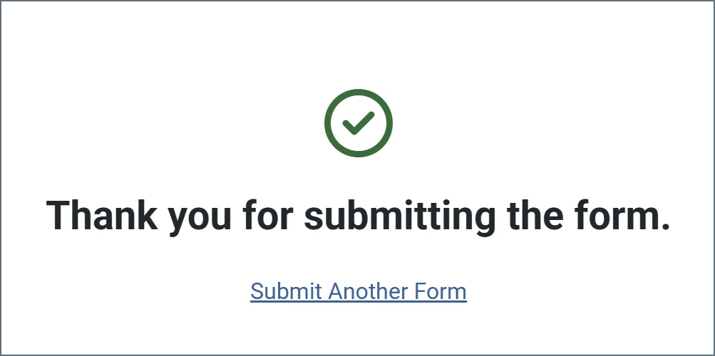
| Success Message | The confirmation message users see after they submit form data successfully. You can change the default message or add additional text. |
Settings Tab
Connector Settings
Settings related to the core configuration of the connector.Advanced Settings
| Setting | Description |
|---|---|
| Local File Scheme | A scheme for assigning filenames to messages that are output by the connector. You can use macros in your filenames dynamically to include information such as identifiers and timestamps. For more information, see Macros. |
Form Users Tab
The Form Users tab lets you create user credentials for clients so that they can access the public endpoint. If a client is not logged into the application administration console already, that client is prompted to enter the User and Password combination when they browse to the endpoint. You can add, edit, and delete credentials on this tab.Adding Users
To add user credentials:- Click Add User to open the Add Form User dialog box.
- Enter a username and password. (Click the eye icon to see the contents of the password field.)
- Click Save Changes and the new user is added to the list of form users.
Editing Users
To edit users:- Click the ellipses next to the user that you want to edit, then click Edit.
- Edit the credentials and click Save. If you decide not to make changes, click Cancel.
Deleting Individual Users
To delete individual users:- Click the ellipses next to the user that you want to edit, then click Remove.
- Click Remove to delete the user or Cancel to cancel the deletion request.
Deleting Multiple Users
To remove multiple users, select the checkboxes for the users you want to delete, then click Remove. Confirm the deletion, or cancel the request.Server Tab
Trusted IP Addresses
Advanced Tab
Logging
Miscellaneous
Alerts Tab
SLAs Tab
Transactions Tab
This tab lists all messages associated with the connector. Use the search bar to find specific messages, or click the funnel icon to apply a filter. You can filter by time, message direction, and/or status. Incoming form responses appear on this tab.Configuring the IIS Server
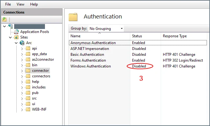
If your instance is hosted on an IIS server and you use Microsoft Windows authentication to login to the application, you must disable Windows authentication for your users. Otherwise, the Form connector cannot properly authenticate users, and the connector will not work properly. To disable Windows authentication:-
In your IIS manager, create a new folder named
connectorin the base application path. -
Select Authentication under IIS (in the right pane) for the
connectorfolder.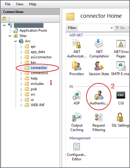
-
Set Windows Authentication to Disabled for this folder.
Creating Forms
Forms have fields, sections, and details:- Section: A heading that groups fields together
- Detail: An object that acts like a pre-configured table where the form user can add as many records as they need for the dataset
- Field: An input box with a label where users enter form data
Adding Sections
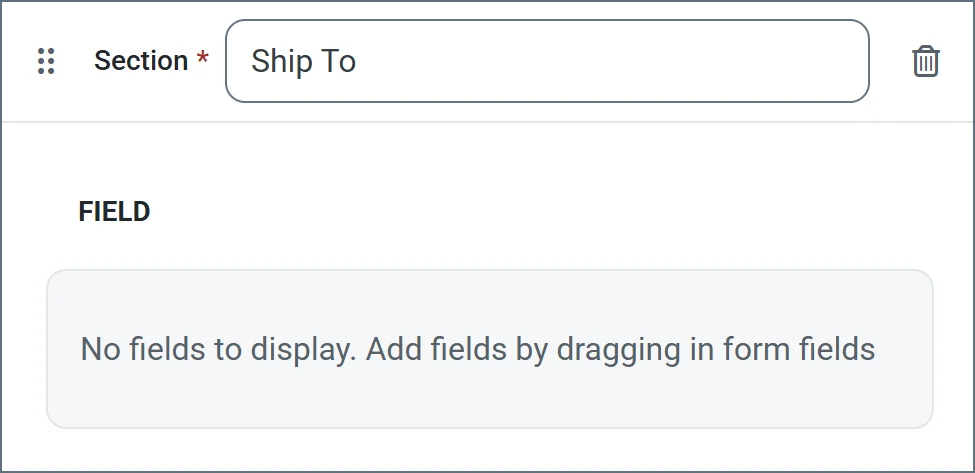
Sections divide fields in the form by categorizing them under a heading. For example, the Ship To section might contain fields like Address, City, and Zip. Sections are not required in order to add fields to the form. However, sections provide logical groupings of items that help users quickly understand the form. To add a section:- Choose Add Section from the dropdown. Enter a section name.
-
Now you can start Adding Fields to the section.
Adding Detail Tables
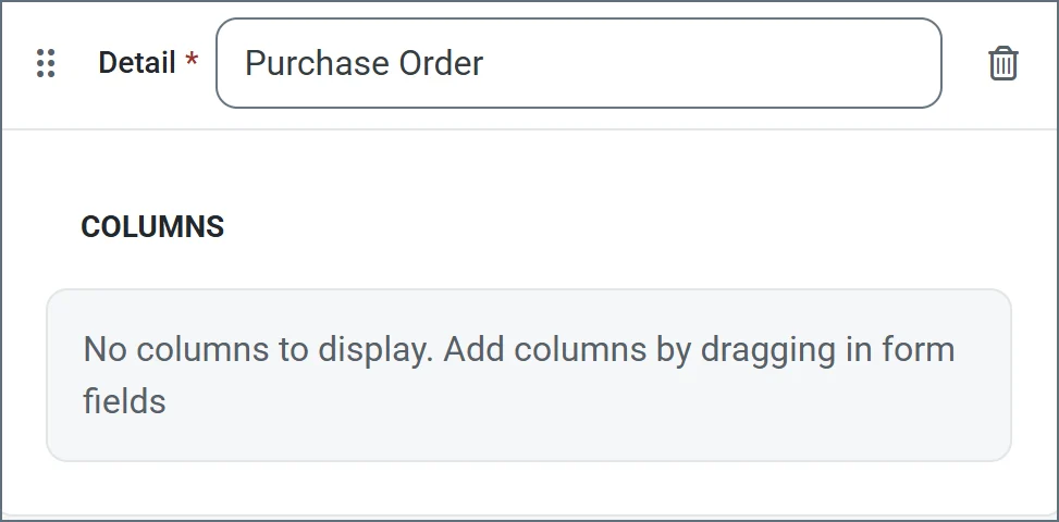
Detail tables allow form creators to embed a table in the web form to enable structured, row-based data entry. They include a configurable number of columns which you define during the form creation. They are ideal for capturing repeatable datasets in a single form submission. End users can then dynamically add as many rows as needed and enter values for each column in those rows. See Accessing Your Form for an example. To add a detail table to your form:- Click Add Detail from the dropdown. Enter a name.
-
Now you are ready to add columns to the table. Select any of the form field types.
Adding Fields
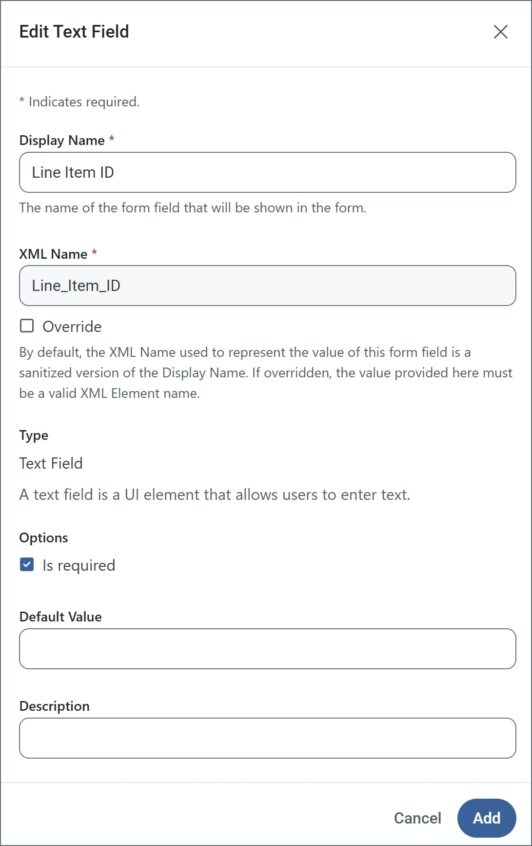
Fields are the basic unit of input for the form. To add a field:- Drag an object from the Form Fields section into your section or detail table.
- Enter a Display Name (for example, Line Item Id). By default, XML Name is populated, but you can use the Override checkbox to supply a different name.
- Use the Is required checkbox to specify whether the field is mandatory.
-
The other options vary based on the form field type. The following example shows a text field being defined. When you are finished defining the field, click Add.
Form Field Types
Text Field Options
- Display Name: Name of the field in the form.
- XML Name: Sanitized version of the Display Name. It must be a valid XML element name.
- Override: Checkbox which allows you to change the default XML Name.
- Is required: Checkbox indicating whether the field is mandatory.
- Default Value: Populates the form with the text supplied here.
- Description: Helper text describing what the field is for.
Dropdown Field Options
- Display Name: Name of the field in the form.
- XML Name: Sanitized version of the Display Name. It must be a valid XML element name.
- Override: Checkbox which allows you to change the default XML Name.
- Dropdown Options: The list of options that appear in the form dropdown field. Click Add Option to add the options you need.
- Is required: Checkbox indicating whether the field is mandatory.
- Default Value: Populates the form with the text supplied here.
- Description: Helper text describing what the field is for.
Radio Button Field Options
- Display Name: Name of the field in the form.
- XML Name: Sanitized version of the Display Name. It must be a valid XML element name.
- Override: Checkbox which allows you to change the default XML Name.
- Radio Button Options: The list of options that appear in the form radio button field. Click Add Option to add the options you need.
- Is required: Checkbox indicating whether the field is mandatory.
- Default Value: Populates the form with the text supplied here.
- Description: Helper text describing what the field is for.
Checkbox Field Options
- Display Name: Name of the field in the form.
- XML Name: Sanitized version of the Display Name. It must be a valid XML element name.
- Override: Checkbox which allows you to change the default XML Name.
- Checkbox Options: The list of options that appear in the form checkbox field. Click Add Option to add the options you need.
- Is required: Checkbox indicating whether the field is mandatory.
- Default Value: Populates the form with the text supplied here.
- Description: Helper text describing what the field is for.
File Upload Field Options
- Display Name: Name of the field in the form.
- XML Name: Sanitized version of the Display Name. It must be a valid XML element name.
- Override: Checkbox which allows you to change the default XML Name.
- Accepted File Type Extensions: The allowed list of upload file types. For example,
.xmlonly accepts XML files. To allow all file types, use*. Click Add Option to add the options you need. - Is required: Checkbox indicating whether the field is mandatory.
- Default Value: Populates the form with the text supplied here.
- Description: Helper text describing what the field is for.
Accessing Your Form
When you finish designing your form, access it by clicking the Form URL link at the top of the designer. The following form is a simple example:
Submitting Form Data
After you create a form, users access the Form connector’s web endpoint and submit data using the form. For fields in the main form, users simply enter the values that correspond to the labels on the form (which are taken from the name of the fields that you created). Users can add rows to the detail table by clicking Add Row. Once a user enters all their data, they click Submit to submit their data. If the submission is successful, a message similar to the following appears.