> ## Documentation Index
> Fetch the complete documentation index at: https://docs.arc.cdata.com/llms.txt
> Use this file to discover all available pages before exploring further.

# Form Connector

> Form connectors expose a public web endpoint where clients fill out a form and submit data into a flow, with a drag-and-drop designer and user authentication support.

export const TrustedIp = () => <>
    <p><strong>Trusted IP Addresses</strong> セクションでは、次の機能を使用できます。</p>

    <table>
      <thead>
        <tr><th>機能</th><th>説明</th></tr>
      </thead>
      <tbody>
        <tr><td><strong>Add</strong></td><td>新しいIP アドレス範囲を入力します。</td></tr>
        <tr><td><strong>Edit</strong></td><td>選択したIP アドレス範囲を変更します。</td></tr>
        <tr><td><strong>Delete</strong></td><td>選択したIP アドレス範囲をリストから削除します。</td></tr>
      </tbody>
    </table>

    <p>この機能には次の制限が適用されます。</p>

    <ul style={{
  listStyleType: 'disc',
  paddingLeft: '1.5rem'
}}>
      <li style={{
  display: 'list-item'
}}><code>localhost</code> はリストから変更または削除できません。</li>
      <li style={{
  display: 'list-item'
}}>定義された範囲外のIP アドレスはすべて拒否されます。</li>
      <li style={{
  display: 'list-item'
}}>範囲がサポートされています。例えば、エントリ<code>100.10.100.1-15</code> は、<code>100.10.100.1</code> から<code>100.10.100.15</code> までのIP アドレスが許可されることを示します。</li>
      <li style={{
  display: 'list-item'
}}>Classless inter-domain routing（CIDR）表記がサポートされています。例えば、エントリ<code>100.10.100.0/24</code> は、<code>100.10.100.0</code> から<code>100.10.100.255</code> までのIP アドレスが許可されることを示します。</li>
      <li style={{
  display: 'list-item'
}}>ワイルドカードパターンがサポートされています。例えば、エントリ<code>100.10.100.*</code> は、<code>100.10.100</code> で始まるIP アドレスが許可されることを示します。</li>
    </ul>

    <Note>
      <p>クライアントがサーバーに到達するには、明確なネットワークパスが必要です。クラウド環境では、次の3か所で変更が必要になる場合があります。</p>
      <p style={{
  paddingLeft: '1.5rem',
  marginTop: '0.25rem',
  marginBottom: '0.25rem'
}}>• クラウドコンソールのネットワークルール。</p>
      <p style={{
  paddingLeft: '1.5rem',
  marginTop: '0.25rem',
  marginBottom: '0.25rem'
}}>• アプリケーションをホストするマシンのファイアウォールルール。例えば、Amazon AMI を使用する場合、<em>Uncomplicated Firewall</em>（UFW）を使用して目的のポートでのトラフィックを許可できます。Linux 環境での一般的な方法は、1024 より小さいポートから1024 より大きい非標準ポートへトラフィックを転送し、アプリケーションがその非標準ポートを使用するように設定することです。これにより、非rootユーザーが1024 より小さいポートにバインドする際の権限の問題を回避できます。</p>
      <p style={{
  paddingLeft: '1.5rem',
  marginTop: '0.25rem',
  marginBottom: '0.25rem'
}}>• <a href="/26.3/cloud/ja/getting-started/administration/settings/security">Security</a> タブの<a href="/26.3/cloud/ja/getting-started/administration/settings/network-access">Network Access</a> 部分。</p>
    </Note>
  </>;

export const NameDescription = ({extraRows}) => <table>
    <thead>
      <tr>
        <th>設定</th>
        <th>説明</th>
      </tr>
    </thead>
    <tbody>
      <tr>
        <td><strong>Connector Id</strong></td>
        <td>コネクタの静的で一意の識別子です。</td>
      </tr>
      <tr>
        <td><strong>Connector Type</strong></td>
        <td>コネクタ名とその機能の説明を表示します。</td>
      </tr>
      <tr>
        <td><strong>Connector Description</strong></td>
        <td>コネクタおよびフロー内でのその役割について自由形式の説明を提供するためのオプションフィールドです。</td>
      </tr>
      {extraRows}
    </tbody>
  </table>;

export const SlasTab = ({siteName = "CData Arc"}) => <>
    <p><em>サービスレベルアグリーメント（SLA）の設定に関する設定です。</em></p>
    <p>
      SLA を使用すると、フロー内のコネクタが送受信すると見込まれるボリュームを設定し、そのボリュームを達成すると見込まれる期間を設定できます。{siteName} は、SLA が達成されない場合にユーザーへ警告するメールを送信し、SLA を<em>At Risk</em> としてマークします。これは、SLA が間もなく達成されない場合に<em>Violated</em> としてマークされることを意味します。これにより、ユーザーは介入してSLA が達成されない理由を特定し、適切な対応を取る機会を得られます。At Risk 期間の終了時点でもSLA が達成されない場合、SLA はviolated としてマークされ、ユーザーに再度通知されます。
    </p>
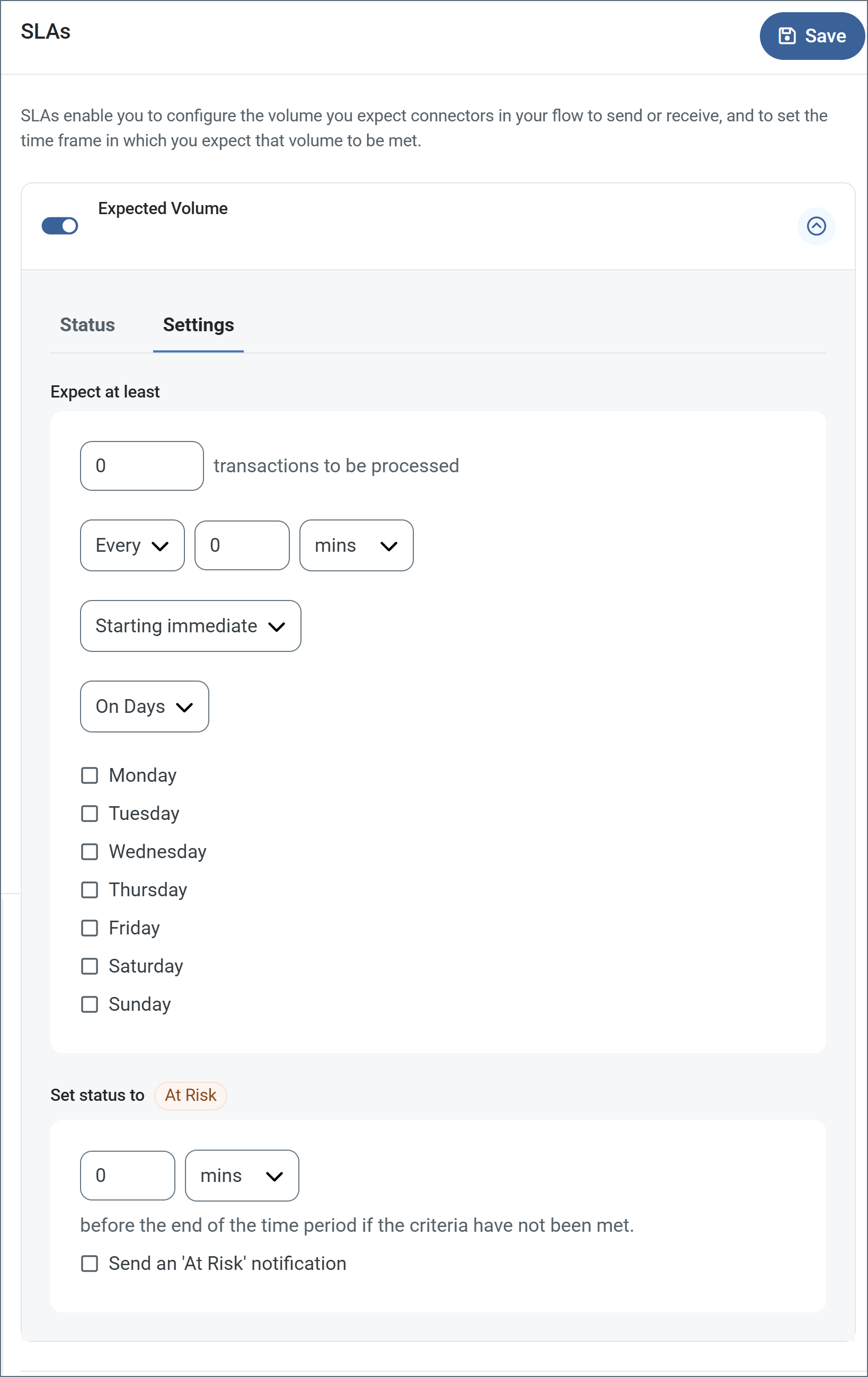
    <p>
      SLA を定義するには、<strong>Expected Volume</strong> をオンに切り替え、<strong>Settings</strong> タブをクリックします。
    </p>
    <img src="/public/images/sla_empty.png" alt="SLA Empty" />
    <ul>
      <li>コネクタに送信と受信の個別のアクションがある場合は、ラジオボタンを使用してSLA がどちらの方向に適用されるかを指定します。</li>
      <li>ウィンドウの<strong>Expect at least</strong> 部分で、次を設定します。
        <ul>
          <li>処理を見込む最小トランザクション数（ボリューム）を設定します。</li>
          <li><strong>Every</strong> フィールドを使用して期間を指定します。</li>
          <li>SLA を有効にするタイミングを指定します。<strong>Starting on</strong> を選択した場合は、日付および時刻フィールドを入力します。</li>
          <li>SLA を有効にしたい曜日のチェックボックスをオンにします。必要に応じて、ドロップダウンで<strong>Everyday</strong> を選択します。</li>
        </ul>
      </li>
      <li>ウィンドウの<strong>Set status to 'At Risk'</strong> 部分で、SLA をAt Risk としてマークするタイミングを指定します。
        <ul>
          <li>デフォルトでは、SLA が違反状態になるまで通知は送信されません。これを変更するには、<strong>Send an 'At Risk' notification</strong> をオンにします。</li>
        </ul>
      </li>
    </ul>
    <p>
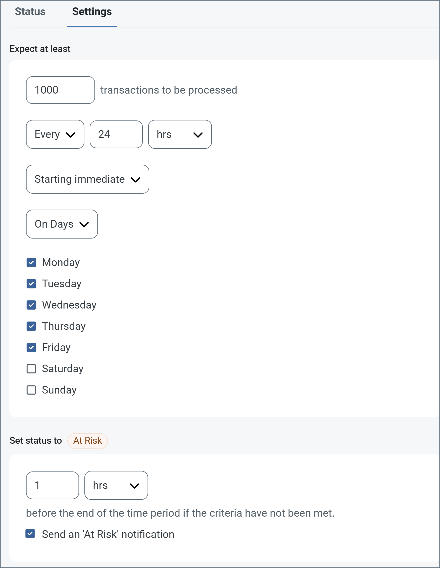
      次の例は、月曜日から金曜日まで毎日1000 件のファイルを受信すると見込むコネクタ向けに設定されたSLA を示しています。1000 件のファイルが受信されていない場合、期間の終了の1時間前にAt Risk 通知が送信されます。
    </p>
    <img src="/public/images/sla_defined.png" alt="SLA Configuration Example" />
    <Note>
      必要に応じてSLA アラートをオフにすることができます。これはメンテナンスウィンドウ中に役立ちます。navbar で<strong>Settings</strong> をクリックし、<strong>Alerts &gt; General Alerts</strong> に移動します。タブレットと鉛筆のアイコンをクリックして編集し、<strong>SLA Alerts</strong> 設定のチェックを外します。
    </Note>
  </>;

export const AlertsTab = ({siteNameShort = "Arc"}) => <>
    <p><em>アラートの設定に関する設定です。</em></p>
    <p>
      サービスレベルアグリーメント（SLA）を実行する前に、通知用のメールアラートをセットアップする必要があります。デフォルトでは、{siteNameShort} は<a href="/26.3/cloud/ja/getting-started/administration/settings/alerts">Alerts</a> タブのグローバル設定を使用します。このコネクタに別の設定を使用するには、<strong>Override global setting</strong> をオンに切り替えます。
    </p>
    <p>
      デフォルトではエラーアラートが有効になっており、エラーが発生するたびにメールが送信されます。これをオフにするには、<strong>Enable</strong> チェックボックスのチェックを外します。
    </p>
    <p>
      <strong>Subject</strong>（必須）を入力します。<strong>Allow {siteNameShort}Script in Subject</strong> をチェックすると、<strong>Subject</strong> フィールドで{siteNameShort}Script を使用できます。これを選択すると、<strong>{siteNameShort}Script エディタ</strong>ボタンが表示されます（<img src="/public/images/rest_arcscript_editor.png" alt="arcscript editor button" style={{
  display: 'inline',
  verticalAlign: 'middle',
  margin: 0
}} />）。
    </p>
    <p>
      必要に応じて<strong>Recipient</strong> のメールアドレスをカンマ区切りのリストで入力します。
    </p>
  </>;

export const MiscConnector = () => <>
    <p><em>Miscellaneous 設定は、特定のユースケース向けの設定です。</em></p>
    <table>
      <thead>
        <tr>
          <th>設定</th>
          <th>説明</th>
        </tr>
      </thead>
      <tbody>
        <tr>
          <td><strong>Other Settings</strong></td>
          <td>非表示のコネクタ設定をセミコロン区切りのリストで設定できます（例：<code>setting1=value1;setting2=value2</code>）。通常のコネクタのユースケースや機能では、これらの設定の使用は必要ありません。</td>
        </tr>
      </tbody>
    </table>
  </>;

export const Logging = () => <>
    <p><em>ログの作成と保存を制御する設定です。</em></p>
    <table>
      <thead>
        <tr>
          <th>設定</th>
          <th>説明</th>
        </tr>
      </thead>
      <tbody>
        <tr>
          <td><strong>Log Level</strong></td>
          <td>コネクタが生成するログの詳細度です。サポートを依頼する際は、これを<strong>Debug</strong> に設定してください。</td>
        </tr>
        <tr>
          <td><strong>Log Subfolder Scheme</strong></td>
          <td>選択した間隔に従って、コネクタがLogs フォルダ内のファイルをグループ化するよう指示します。<strong>Weekly</strong> オプション（デフォルト）は、コネクタが毎週新しいサブフォルダを作成し、その週のすべてのログをそのフォルダに保存するよう指示します。この設定を空白のままにすると、コネクタはすべてのログをLogs フォルダに直接保存します。多数のトランザクションを処理するコネクタでは、サブフォルダを使用することでログを整理しやすくなり、パフォーマンスが向上します。</td>
        </tr>
        <tr>
          <td><strong>Log Messages</strong></td>
          <td>処理したファイルのログエントリにファイル自体のコピーを含めるには、これをオンにします。これを無効にすると、<strong>Transactions</strong> タブからファイルのコピーをダウンロードできなくなる場合があります。</td>
        </tr>
      </tbody>
    </table>
  </>;

export const MacrosExamples = ({extraMacros = []}) => <>
    <p>
      %Ext% や %ShortDate% などの一部のマクロは引数を必要としませんが、引数を必要とするものもあります。
      引数を取るすべてのマクロは次の構文を使用します。<code>%Macro:argument%</code>
    </p>

    <p>引数を取るマクロの例を次に示します。</p>

    <ul>
      <li>%Header:headername%：<code>headername</code> はメッセージ上のヘッダーの名前です。</li>
      <li>%Header:mycustomheader% は、入力メッセージに設定された<code>mycustomheader</code> ヘッダーの値に解決されます。</li>
      <li>%Header:ponum% は、入力メッセージに設定された<code>ponum</code> ヘッダーの値に解決されます。</li>
      <li>%RegexFilename:pattern%：<code>pattern</code> は正規表現パターンです。例えば、<code>%RegexFilename:^([\w][A-Za-z]+)%</code> は、ファイル名の最初の単語にマッチしてそれに解決され、大文字・小文字を区別しません（<code>test_file.xml</code> は<code>test</code> に解決されます）。</li>
      <li>%Vault:vaultitem%：<code>vaultitem</code> は<a href="/26.3/cloud/ja/getting-started/administration/settings/global-settings-vault">Vault</a> 内のアイテムの名前です。例えば、<code>%Vault:companyname%</code> は、Vault に保存された<code>companyname</code> アイテムの値に解決されます。</li>
      <li>%DateFormat:format%：<code>format</code> は許容される日付形式です（詳細は<a href="/26.3/cloud/ja/scripting/value-formatters/date-formatters#sample-date-formats">日付形式のサンプル</a>を参照してください）。例えば、<code>%DateFormat:yyyy-MM-dd-HH-mm-ss-fff%</code> は、ファイルの日付とタイムスタンプに解決されます。</li>
      {extraMacros.filter(item => item.example).map(item => <li key={`ex-${item.name}`}>{item.example}</li>)}
    </ul>

    <p>次の例に示すように、より高度なマクロを作成することもできます。</p>

    <ul>
      <li>1 つのファイル名で複数のマクロを組み合わせる：<code>%DateFormat:yyyy-MM-dd-HH-mm-ss-fff%%EXT%</code></li>
      <li>マクロの外側にテキストを含める：<code>MyFile_%DateFormat:yyyy-MM-dd-HH-mm-ss-fff%</code></li>
      <li>マクロの内側にテキストを含める：<code>%DateFormat:'DateProcessed-'yyyy-MM-dd_'TimeProcessed-'HH-mm-ss%</code></li>
    </ul>
  </>;

export const MacrosTable = ({siteName = "CData Arc", extraMacros = []}) => <>
    <p>
      ファイル命名戦略でマクロを使用すると、データの整理効率と文脈の理解を高めることができます。
      ファイル名にマクロを組み込むことで、識別子、タイムスタンプ、ヘッダー情報などの関連情報を
      動的に含めることができ、各ファイルに有用な文脈を提供します。
    </p>

    <p>{siteName} は次のマクロをサポートしています。これらはすべて次の構文を使用します。<code>%Macro%</code></p>

    <table>
      <thead>
        <tr><th>マクロ</th><th>説明</th></tr>
      </thead>
      <tbody>
        <tr><td>ConnectorID</td><td>コネクタのConnectorID に評価されます。</td></tr>
        <tr><td>ConnectorName</td><td>コネクタの名前に評価されます。ファイル名やパスに接続名を含めることができます。例えば、どのデータベース接続が生成したかによってバックアップファイルにタグを付けるために使用できます。</td></tr>
        <tr><td>Ext</td><td>コネクタが現在処理しているファイルの拡張子に評価されます。</td></tr>
        <tr><td>Filename</td><td>コネクタが現在処理しているファイルのファイル名（拡張子を含む）に評価されます。</td></tr>
        <tr><td>FilenameNoExt</td><td>コネクタが現在処理しているファイルのファイル名（拡張子を除く）に評価されます。</td></tr>
        <tr><td>MessageId</td><td>コネクタが出力しているメッセージのMessageId に評価されます。</td></tr>
        <tr><td>RegexFilename:<em>pattern</em></td><td>コネクタが現在処理しているファイルのファイル名に正規表現パターンを適用します。</td></tr>
        <tr><td>Header:<em>headername</em></td><td>コネクタが現在処理しているメッセージ上の対象ヘッダー（<code>headername</code>）の値に評価されます。</td></tr>
        <tr><td>LongDate</td><td>システムの現在の日時を長い形式（例：Wednesday, January 24, 2024）で評価します。</td></tr>
        <tr><td>ShortDate</td><td>システムの現在の日時をyyyy-MM-dd 形式（例：2024-01-24）で評価します。</td></tr>
        <tr><td>DateFormat:<em>format</em></td><td>システムの現在の日時を指定された形式（<code>format</code>）で評価します。利用可能な日時形式については、<a href="/26.3/cloud/ja/scripting/value-formatters/date-formatters#date-formats-with-literal-characters">日付形式のサンプル</a>を参照してください。</td></tr>
        <tr><td>Vault:<em>vaultitem</em></td><td>指定されたVault アイテムの値に評価されます。</td></tr>
        {extraMacros.map(item => <tr key={item.name}>
            <td>{item.name}</td>
            <td>{item.description}</td>
          </tr>)}
      </tbody>
    </table>
  </>;

export const siteNameShort = "Arc";

export const siteName = "CData Arc";

Form connectors expose a public web endpoint where clients fill out a form and submit that data into a {siteName} flow.

## Key Capabilities

* Web-based form creation with drag-and-drop designer
* Support for sections, detail tables, and multiple field types
* User authentication and access control for form submissions
* Dynamic form generation with customizable branding and success messages

## Overview

Forms are created on the connector **Form Designer** tab. A form is divided into sections and detail tables, each of which can have a variable number of fields. For details, see [Creating Forms](#creating-forms).

When you use a Form connector to submit new data, you should place the connector at the start of a connected flow. Clients can connect to the web endpoint, view and fill out the form, and submit this data into the configured {siteNameShort} flow. For more information, see [Submitting Form Data](#submitting-form-data).

The following sections explain how to configure the connector, create forms, and submit new form data.

## Connector Configuration

This section contains all of the configurable connector properties.

### Form Designer Tab

*Settings related to building a set of form fields that are organized into sections and detail tables.*

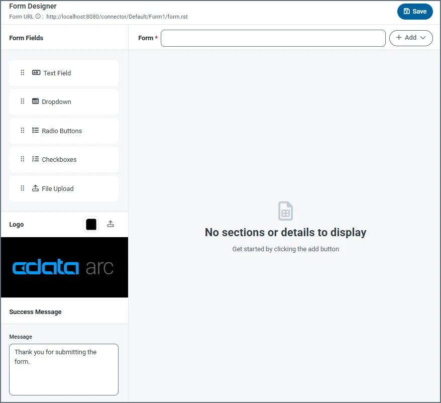
<img src="https://mintcdn.com/cdata-arc/Lo_2D5t4szDfleFN/public/images/Form_connector_form_designer.png?fit=max&auto=format&n=Lo_2D5t4szDfleFN&q=85&s=6beeba37012cbd774a7b7784f7dd8e46" width="700" data-path="public/images/Form_connector_form_designer.png" />

When clients connect to the configured endpoint and submit a form, they see fields that are laid out exactly as they are configured in the panel above.

The designer includes the following settings (see [Creating Forms](#creating-forms) for more details).

| Setting             | Description                                                                                                                                                                                                                                                                                                                                                                                                                                                                                                                            |
| ------------------- | -------------------------------------------------------------------------------------------------------------------------------------------------------------------------------------------------------------------------------------------------------------------------------------------------------------------------------------------------------------------------------------------------------------------------------------------------------------------------------------------------------------------------------------- |
| **Form URL**        | A link to the published form.                                                                                                                                                                                                                                                                                                                                                                                                                                                                                                          |
| **Form**            | Title of the form (for example, your company name).                                                                                                                                                                                                                                                                                                                                                                                                                                                                                    |
| **Add**             | Dropdown to add a section or a detail table. **Add Section** lets you add specific sections to a form, and **Add Detail** lets you add a detail table to the form. Detail tables act like a pre-configured table where the form user can add as many records as they need for the dataset.                                                                                                                                                                                                                                             |
| **Form Fields**     | Drag and drop fields into detail table and section areas of the form. Repeat this as many times as necessary. The field types are:<br />**Text Field** — An input text box with a name and description.<br />**Dropdown** — A dropdown list with name and dropdown options.<br />**Radio Buttons** — A set of radio buttons with name and radio button options.<br />**Checkboxes** — A set of checkboxes with name and checkbox options.<br />**File Upload** — Allows form users to upload specific file types directly to the form. |
| **Logo**            | Upload your company logo, which appears at the top of the form. By default it uses the {siteName} logo. You can also change the color of the banner.                                                                                                                                                                                                                                                                                                                                                                                   |
| **Success Message** | The confirmation message users see after they submit form data successfully. You can change the default message or add additional text.                                                                                                                                                                                                                                                                                                                                                                                                |

### Settings Tab

#### Connector Settings

*Settings related to the core configuration of the connector.*

<NameDescription />

#### Advanced Settings

| Setting               | Description                                                                                                                                                                                                                             |
| --------------------- | --------------------------------------------------------------------------------------------------------------------------------------------------------------------------------------------------------------------------------------- |
| **Local File Scheme** | A scheme for assigning filenames to messages that are output by the connector. You can use macros in your filenames dynamically to include information such as identifiers and timestamps. For more information, see [Macros](#macros). |

### Form Users Tab

The **Form Users** tab lets you create user credentials for clients so that they can access the public endpoint. If a client is not logged into the application administration console already, that client is prompted to enter the **User** and **Password** combination when they browse to the endpoint.

You can add, edit, and delete credentials on this tab.

#### Adding Users

To add user credentials:

1. Click **Add User** to open the **Add Form User** dialog box.

2. Enter a username and password. (Click the eye icon to see the contents of the password field.)

3. Click **Save Changes** and the new user is added to the list of form users.

#### Editing Users

To edit users:

1. Click the ellipses next to the user that you want to edit, then click **Edit**.

2. Edit the credentials and click **Save**. If you decide not to make changes, click **Cancel**.

#### Deleting Individual Users

To delete individual users:

1. Click the ellipses next to the user that you want to edit, then click **Remove**.

2. Click **Remove** to delete the user or **Cancel** to cancel the deletion request.

#### Deleting Multiple Users

To remove multiple users, select the checkboxes for the users you want to delete, then click **Remove**. Confirm the deletion, or cancel the request.

### Server Tab

#### Trusted IP Addresses

<TrustedIp />

### Advanced Tab

#### Logging

<Logging />

#### Miscellaneous

<MiscConnector />

### Alerts Tab

<AlertsTab />

### SLAs Tab

<SlasTab />

### Transactions Tab

This tab lists all messages associated with the connector. Use the search bar to find specific messages, or click the funnel icon to apply a filter. You can filter by time, message direction, and/or status.

Incoming form responses appear on this tab.

## Configuring the IIS Server

If your {siteNameShort} instance is hosted on an IIS server and you use Microsoft Windows authentication to login to the application, you must disable Windows authentication for your users. Otherwise, the Form connector cannot properly authenticate users, and the connector will not work properly.

To disable Windows authentication:

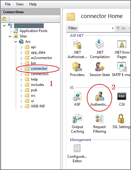
1. In your IIS manager, create a new folder named `connector` in the base application path.

2. Select **Authentication** under **IIS** (in the right pane) for the `connector` folder.

   <img src="https://mintcdn.com/cdata-arc/6KwLqCromZpN96Gn/public/images/form_iis_1.png?fit=max&auto=format&n=6KwLqCromZpN96Gn&q=85&s=e77c9c7c75acdf035f32ca851489c4f1" width="450" data-path="public/images/form_iis_1.png" />

3. Set **Windows Authentication** to **Disabled** for this folder.
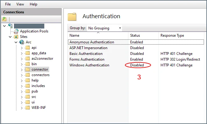
   <img src="https://mintcdn.com/cdata-arc/6KwLqCromZpN96Gn/public/images/form_iis_2.png?fit=max&auto=format&n=6KwLqCromZpN96Gn&q=85&s=78fb1c327a11c957ca15a2be6b318c47" width="500" data-path="public/images/form_iis_2.png" />

## Creating Forms

Forms have fields, sections, and details:

* **Section**: A heading that groups fields together
* **Detail**: An object that acts like a pre-configured table where the form user can add as many records as they need for the dataset
* **Field**: An input box with a label where users enter form data

To get started, click the **Add** button next to the form title, and choose whether to **Add Section** or **Add Detail**.

### Adding Sections

*Sections* divide fields in the form by categorizing them under a heading. For example, the **Ship To** section might contain fields like **Address**, **City**, and **Zip**.

Sections are not required in order to add fields to the form. However, sections provide logical groupings of items that help users quickly understand the form.

To add a section:

1. Choose **Add Section** from the dropdown. Enter a section name.

2. Now you can start [Adding Fields](#adding-fields) to the section.
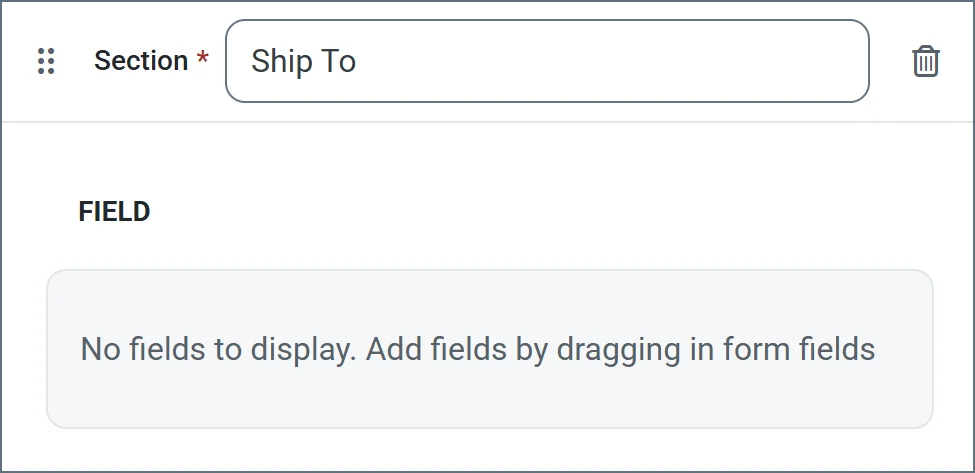
   <img src="https://mintcdn.com/cdata-arc/Lo_2D5t4szDfleFN/public/images/Form_connector_form_designer_add_section_results.png?fit=max&auto=format&n=Lo_2D5t4szDfleFN&q=85&s=d6f8febed25e4113a2ca6e9ef2d20a72" width="450" data-path="public/images/Form_connector_form_designer_add_section_results.png" />

### Adding Detail Tables

*Detail* tables allow form creators to embed a table in the web form to enable structured, row-based data entry. They include a configurable number of columns which you define during the form creation. They are ideal for capturing repeatable datasets in a single form submission. End users can then dynamically add as many rows as needed and enter values for each column in those rows. See [Accessing Your Form](#accessing-your-form) for an example.

To add a detail table to your form:

1. Click **Add Detail** from the dropdown. Enter a name.

2. Now you are ready to add columns to the table. Select any of the [form field types](#form-field-types).
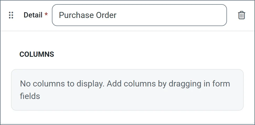
   <img src="https://mintcdn.com/cdata-arc/Lo_2D5t4szDfleFN/public/images/Form_connector_form_designer_add_detail_result.png?fit=max&auto=format&n=Lo_2D5t4szDfleFN&q=85&s=5d506e4e0a8ea45153aaeaf6807b37dd" width="450" data-path="public/images/Form_connector_form_designer_add_detail_result.png" />

### Adding Fields

*Fields* are the basic unit of input for the form.

To add a field:

1. Drag an object from the **Form Fields** section into your section or detail table.

2. Enter a **Display Name** (for example, Line Item Id). By default, **XML Name** is populated, but you can use the **Override** checkbox to supply a different name.

3. Use the **Is required** checkbox to specify whether the field is mandatory.

4. The other options vary based on the [form field type](#form-field-types). The following example shows a text field being defined. When you are finished defining the field, click **Add**.
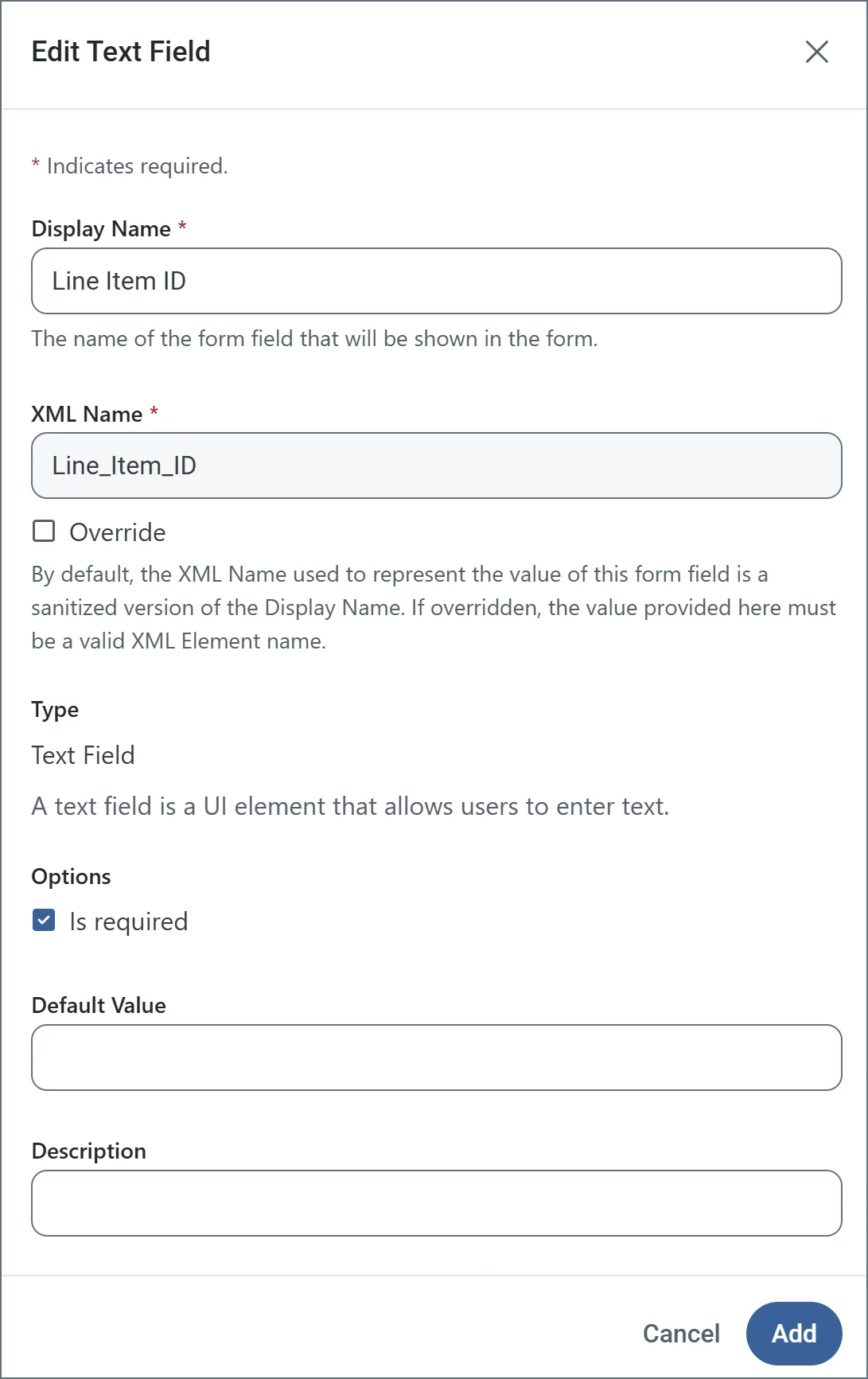
   <img src="https://mintcdn.com/cdata-arc/Lo_2D5t4szDfleFN/public/images/Form_connector_form_designer_form_field.png?fit=max&auto=format&n=Lo_2D5t4szDfleFN&q=85&s=75ccbf5e406ee56614547dd543bff75c" width="450" data-path="public/images/Form_connector_form_designer_form_field.png" />

<Tip>
  <p>To edit a field, click the link to its name, or the ellipses to the right of the name.</p>
  <p>To remove a field, click the ellipses and choose **Remove Instance**.</p>
  <p> Drag and drop fields in a section or detail table to reorder their position in the form.</p>
</Tip>

### Form Field Types

#### Text Field Options

* Display Name: Name of the field in the form.
* XML Name: Sanitized version of the Display Name. It must be a valid XML element name.
* Override: Checkbox which allows you to change the default XML Name.
* Is required: Checkbox indicating whether the field is mandatory.
* Default Value: Populates the form with the text supplied here.
* Description: Helper text describing what the field is for.

#### Dropdown Field Options

* Display Name: Name of the field in the form.
* XML Name: Sanitized version of the Display Name. It must be a valid XML element name.
* Override: Checkbox which allows you to change the default XML Name.
* Dropdown Options: The list of options that appear in the form dropdown field. Click **Add Option** to add the options you need.
* Is required: Checkbox indicating whether the field is mandatory.
* Default Value: Populates the form with the text supplied here.
* Description: Helper text describing what the field is for.

#### Radio Button Field Options

* Display Name: Name of the field in the form.
* XML Name: Sanitized version of the Display Name. It must be a valid XML element name.
* Override: Checkbox which allows you to change the default XML Name.
* Radio Button Options: The list of options that appear in the form radio button field. Click **Add Option** to add the options you need.
* Is required: Checkbox indicating whether the field is mandatory.
* Default Value: Populates the form with the text supplied here.
* Description: Helper text describing what the field is for.

#### Checkbox Field Options

* Display Name: Name of the field in the form.
* XML Name: Sanitized version of the Display Name. It must be a valid XML element name.
* Override: Checkbox which allows you to change the default XML Name.
* Checkbox Options: The list of options that appear in the form checkbox field. Click **Add Option** to add the options you need.
* Is required: Checkbox indicating whether the field is mandatory.
* Default Value: Populates the form with the text supplied here.
* Description: Helper text describing what the field is for.

#### File Upload Field Options

* Display Name: Name of the field in the form.
* XML Name: Sanitized version of the Display Name. It must be a valid XML element name.
* Override: Checkbox which allows you to change the default XML Name.
* Accepted File Type Extensions: The allowed list of upload file types. For example, `.xml` only accepts XML files. To allow all file types, use `*`. Click **Add Option** to add the options you need.
* Is required: Checkbox indicating whether the field is mandatory.
* Default Value: Populates the form with the text supplied here.
* Description: Helper text describing what the field is for.

### Accessing Your Form

When you finish designing your form, access it by clicking the **Form URL** link at the top of the designer. The following form is a simple example:

<img src="https://mintlify.s3.us-west-1.amazonaws.com/cdata-arc/public/images/Form_connector_final_form.png" width="650" />

## Submitting Form Data

After you create a form, users access the Form connector's web endpoint and submit data using the form.

For fields in the main form, users simply enter the values that correspond to the labels on the form (which are taken from the name of the fields that you created).

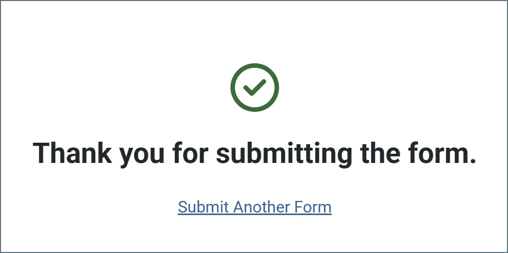
Users can add rows to the detail table by clicking **Add Row**. Once a user enters all their data, they click **Submit** to submit their data. If the submission is successful, a message similar to the following appears.
<img src="https://mintcdn.com/cdata-arc/Lo_2D5t4szDfleFN/public/images/Form_connector_form_designer_success_message.png?fit=max&auto=format&n=Lo_2D5t4szDfleFN&q=85&s=dc4a0a18a7e78a5e73005d98f42f5b88" width="250" data-path="public/images/Form_connector_form_designer_success_message.png" />

When a user submits a form, the form data is pushed to the **Transactions** tab. The output is an XML file that contains the following structure:

```xml theme={null}
<Items>
  <FormTitle>
    <FieldA>data</FieldA>
    <FieldB>more data</FieldB>
    <FieldC>even more data</FieldC>
    <DetailTitle>
      <SubFieldA>123</SubFieldA>
      <SubFieldB>456</SubFieldB>
    </DetailTitle>
    <DetailTitle>
      <SubFieldA>135</SubFieldA>
      <SubFieldB>246</SubFieldB>
    </DetailTitle>
  </FormTitle>
</Items>
```

This output is well suited to being processed by an [XML Map Connector](./xml-map/xml-map) so that it can be mapped into an XML format that is usable by another connector.

## Macros

<MacrosTable />

### Examples

<MacrosExamples />