 ).
).
The following functions are available in the Trusted IP Addresses section:
| Function | Description |
|---|---|
| Add | Enter a new IP address range. |
| Edit | Modify the selected IP address range. |
| Delete | Deletes the selected IP address range from the list. |
The following restrictions apply to this feature:
localhost cannot be modified or removed from the list.100.10.100.1-15 indicates that IP addresses between 100.10.100.1 and 100.10.100.15 are allowed.100.10.100.0/24 indicates that IP addresses between 100.10.100.0 and 100.10.100.255 are allowed.100.10.100.* indicates that IP addresses beginning with 100.10.100 are allowed.In order for clients to reach the server, a clear network path is required. In cloud environments you might need to make changes in three places:
• The networking rules in the cloud console.
• The firewall rules on the machine hosting the application. For example, when using an Amazon AMI, you might use an Uncomplicated Firewall (UFW) to allow traffic on the desired port. A common strategy in Linux environments is to forward traffic from ports lower than 1024 to a non-standard port higher than 1024, while configuring the application to use the non-standard port. This avoids permission issues associated with non-root users binding to ports lower than 1024.
• The Network Access portion of the Security tab.
| Setting | Description |
|---|---|
| Connector Id | The static, unique identifier for the connector. |
| Connector Type | Displays the connector name and a description of what it does. |
| Connector Description | An optional field to provide a free-form description of the connector and its role in the flow. |
Settings related to configuring Service Level Agreements (SLAs).
SLAs enable you to configure the volume you expect connectors in your flow to send or receive, and to set the time frame in which you expect that volume to be met. {siteName} sends emails to warn the user when an SLA is not met, and marks the SLA as At Risk, which means that if the SLA is not met soon, it will be marked as Violated. This gives the user an opportunity to step in and determine the reasons the SLA is not being met, and to take appropriate actions. If the SLA is still not met at the end of the at-risk time period, the SLA is marked as violated, and the user is notified again.
To define an SLA, toggle Expected Volume on, then click the Settings tab.
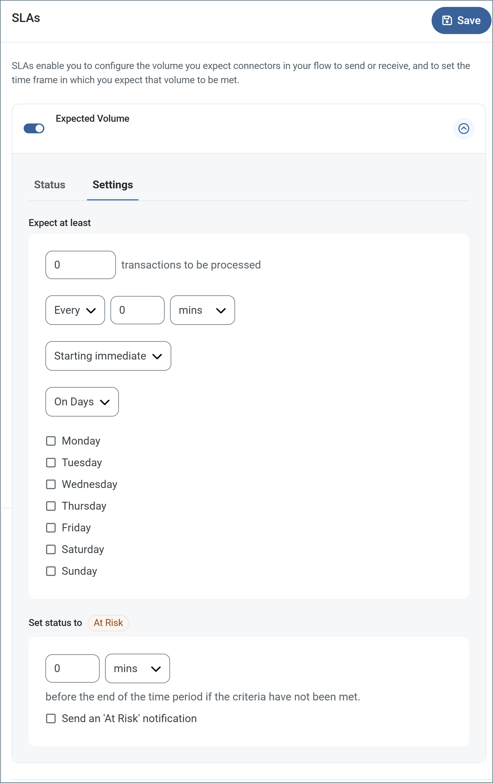
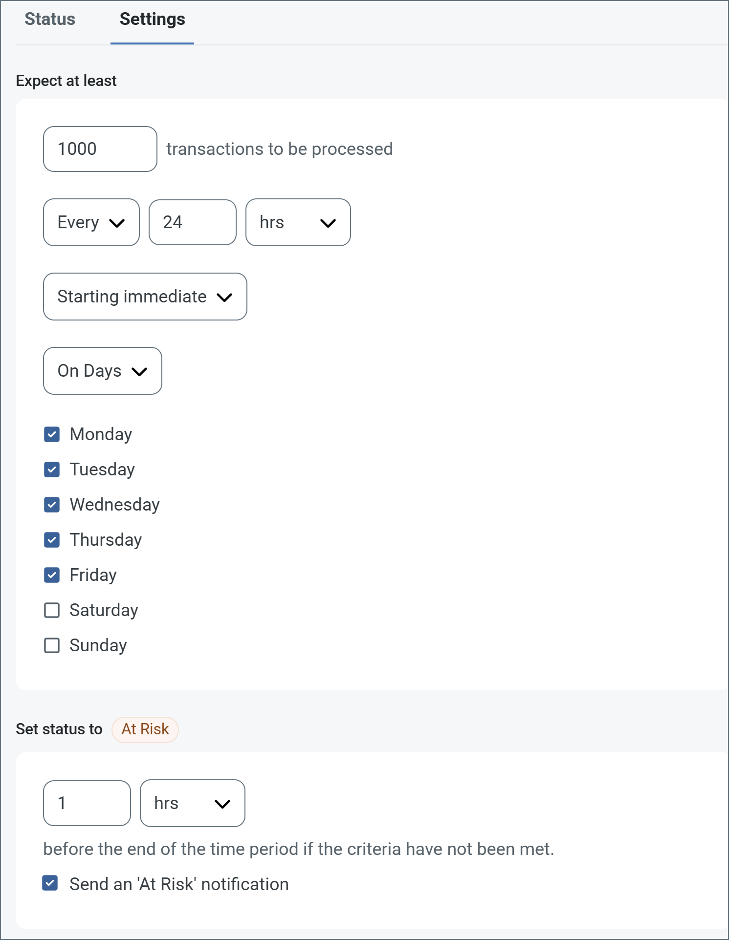
The following example shows an SLA configured for a connector that expects to receive 1000 files every day Monday-Friday. An at-risk notification is sent 1 hour before the end of the time period if the 1000 files have not been received.
Settings related to configuring alerts.
Before you can execute Service Level Agreements (SLAs), you need to set up email alerts for notifications. By default, {siteNameShort} uses the global settings on the Alerts tab. To use other settings for this connector, toggle Override global setting on.
By default, error alerts are enabled, which means that emails are sent whenever there is an error. To turn them off, uncheck the Enable checkbox.
Enter a Subject (mandatory). Check Allow {siteNameShort}Script in Subject to use {siteNameShort}Script in the Subject field. When you select this, the {siteNameShort}Script Editor button appears ().
Optionally, enter a comma-separated list of Recipient emails.
; export const MiscConnector = () => <>Miscellaneous settings are for specific use cases.
| Setting | Description |
|---|---|
| Other Settings | Enables you to configure hidden connector settings in a semicolon-separated list (for example, setting1=value1;setting2=value2). Normal connector use cases and functionality should not require the use of these settings. |
Settings that govern the creation and storage of logs.
| Setting | Description |
|---|---|
| Log Level | The verbosity of logs generated by the connector. When you request support, set this to Debug. |
| Log Subfolder Scheme | Instructs the connector to group files in the Logs folder according to the selected interval. The Weekly option (which is the default) instructs the connector to create a new subfolder each week and store all logs for the week in that folder. Leaving this setting blank tells the connector to save all logs directly in the Logs folder. For connectors that process many transactions, using subfolders helps keep logs organized and improves performance. |
| Log Messages | Check this to have the log entry for a processed file include a copy of the file itself. If you disable this, you might not be able to download a copy of the file from the Transactions tab. |
Some macros, such as %Ext% and %ShortDate%, do not require an argument, but others do. All
macros that take an argument use the following syntax: %Macro:argument%
Here are some examples of the macros that take an argument:
headername is the name of a header on a message.mycustomheader header set on the input message.ponum header set on the input message.pattern is a regex pattern. For example, %RegexFilename:^([\w][A-Za-z]+)% matches and resolves to the first word in the filename and is case insensitive (test_file.xml resolves to test).vaultitem is the name of an item in the vault. For example, %Vault:companyname% resolves to the value of the companyname item stored in the vault.format is an accepted date format (see Sample Date Formats for details). For example, %DateFormat:yyyy-MM-dd-HH-mm-ss-fff% resolves to the date and timestamp on the file.You can also create more sophisticated macros, as shown in the following examples:
%DateFormat:yyyy-MM-dd-HH-mm-ss-fff%%EXT%MyFile_%DateFormat:yyyy-MM-dd-HH-mm-ss-fff%%DateFormat:'DateProcessed-'yyyy-MM-dd_'TimeProcessed-'HH-mm-ss%Using macros in file naming strategies can enhance organizational efficiency and contextual understanding of data. By incorporating macros into filenames, you can dynamically include relevant information such as identifiers, timestamps, and header information, providing valuable context to each file.
{siteName} supports these macros, which all use the following syntax: %Macro%.
| Macro | Description |
|---|---|
| ConnectorID | Evaluates to the ConnectorID of the connector. |
| ConnectorName | Evaluates to the name of the connector. Enables you to include the connection name in file names or paths: for example, to tag backup files by which database connection produced them. |
| Ext | Evaluates to the file extension of the file currently being processed by the connector. |
| Filename | Evaluates to the filename (extension included) of the file currently being processed by the connector. |
| FilenameNoExt | Evaluates to the filename (without the extension) of the file currently being processed by the connector. |
| MessageId | Evaluates to the MessageId of the message being output by the connector. |
| RegexFilename:pattern | Applies a RegEx pattern to the filename of the file currently being processed by the connector. |
| Header:headername | Evaluates to the value of a targeted header (headername) on the current message being processed by the connector. |
| LongDate | Evaluates to the current datetime of the system in long-handed format (for example, Wednesday, January 24, 2024). |
| ShortDate | Evaluates to the current datetime of the system in a yyyy-MM-dd format (for example, 2024-01-24). |
| DateFormat:format | Evaluates to the current datetime of the system in the specified format (format). See Sample Date Formats for the available datetime formats. |
| Vault:vaultitem | Evaluates to the value of the specified vault item. |
| {item.name} | {item.description} |
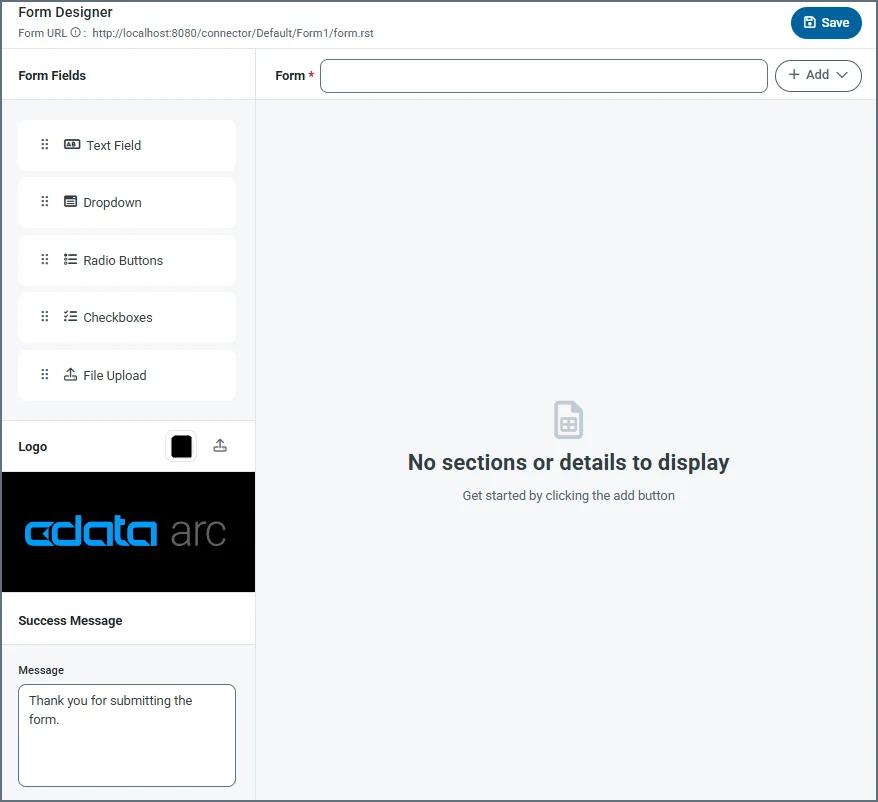 When clients connect to the configured endpoint and submit a form, they see fields that are laid out exactly as they are configured in the panel above.
The designer includes the following settings (see [Creating Forms](#creating-forms) for more details).
| Setting | Description |
| ------------------- | -------------------------------------------------------------------------------------------------------------------------------------------------------------------------------------------------------------------------------------------------------------------------------------------------------------------------------------------------------------------------------------------------------------------------------------------------------------------------------------------------------------------------------------- |
| **Form URL** | A link to the published form. |
| **Form** | Title of the form (for example, your company name). |
| **Add** | Dropdown to add a section or a detail table. **Add Section** lets you add specific sections to a form, and **Add Detail** lets you add a detail table to the form. Detail tables act like a pre-configured table where the form user can add as many records as they need for the dataset. |
| **Form Fields** | Drag and drop fields into detail table and section areas of the form. Repeat this as many times as necessary. The field types are:
When clients connect to the configured endpoint and submit a form, they see fields that are laid out exactly as they are configured in the panel above.
The designer includes the following settings (see [Creating Forms](#creating-forms) for more details).
| Setting | Description |
| ------------------- | -------------------------------------------------------------------------------------------------------------------------------------------------------------------------------------------------------------------------------------------------------------------------------------------------------------------------------------------------------------------------------------------------------------------------------------------------------------------------------------------------------------------------------------- |
| **Form URL** | A link to the published form. |
| **Form** | Title of the form (for example, your company name). |
| **Add** | Dropdown to add a section or a detail table. **Add Section** lets you add specific sections to a form, and **Add Detail** lets you add a detail table to the form. Detail tables act like a pre-configured table where the form user can add as many records as they need for the dataset. |
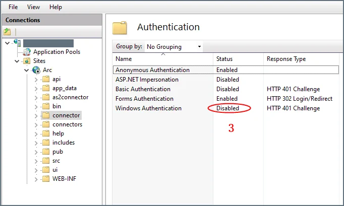
| **Form Fields** | Drag and drop fields into detail table and section areas of the form. Repeat this as many times as necessary. The field types are: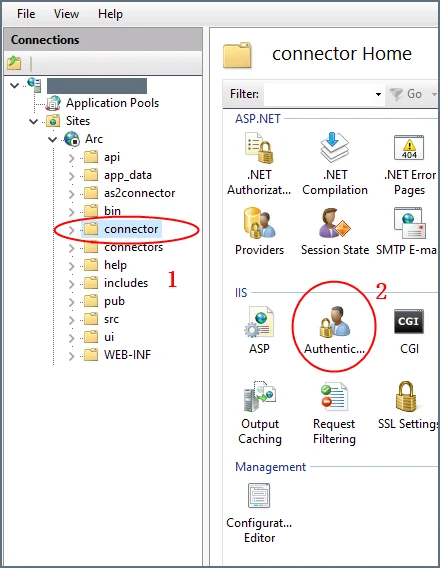 3. Set **Windows Authentication** to **Disabled** for this folder.
 ## Creating Forms
Forms have fields, sections, and details:
* **Section**: A heading that groups fields together
* **Detail**: An object that acts like a pre-configured table where the form user can add as many records as they need for the dataset
* **Field**: An input box with a label where users enter form data
To get started, click the **Add** button next to the form title, and choose whether to **Add Section** or **Add Detail**.
### Adding Sections
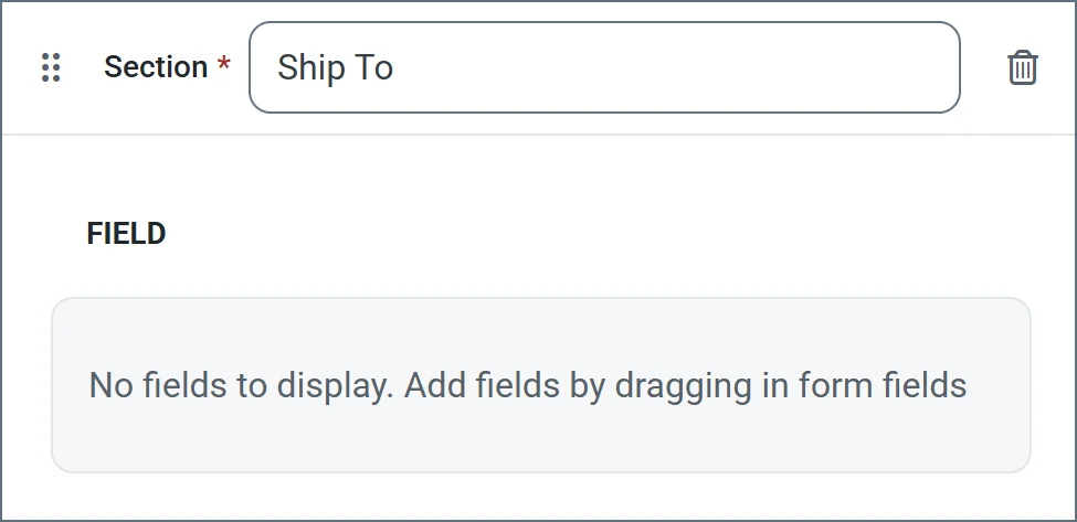
*Sections* divide fields in the form by categorizing them under a heading. For example, the **Ship To** section might contain fields like **Address**, **City**, and **Zip**.
Sections are not required in order to add fields to the form. However, sections provide logical groupings of items that help users quickly understand the form.
To add a section:
1. Choose **Add Section** from the dropdown. Enter a section name.
2. Now you can start [Adding Fields](#adding-fields) to the section.
## Creating Forms
Forms have fields, sections, and details:
* **Section**: A heading that groups fields together
* **Detail**: An object that acts like a pre-configured table where the form user can add as many records as they need for the dataset
* **Field**: An input box with a label where users enter form data
To get started, click the **Add** button next to the form title, and choose whether to **Add Section** or **Add Detail**.
### Adding Sections
*Sections* divide fields in the form by categorizing them under a heading. For example, the **Ship To** section might contain fields like **Address**, **City**, and **Zip**.
Sections are not required in order to add fields to the form. However, sections provide logical groupings of items that help users quickly understand the form.
To add a section:
1. Choose **Add Section** from the dropdown. Enter a section name.
2. Now you can start [Adding Fields](#adding-fields) to the section.
 ### Adding Detail Tables
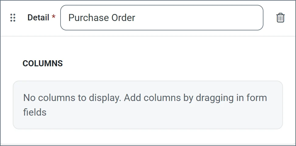
*Detail* tables allow form creators to embed a table in the web form to enable structured, row-based data entry. They include a configurable number of columns which you define during the form creation. They are ideal for capturing repeatable datasets in a single form submission. End users can then dynamically add as many rows as needed and enter values for each column in those rows. See [Accessing Your Form](#accessing-your-form) for an example.
To add a detail table to your form:
1. Click **Add Detail** from the dropdown. Enter a name.
2. Now you are ready to add columns to the table. Select any of the [form field types](#form-field-types).
### Adding Detail Tables
*Detail* tables allow form creators to embed a table in the web form to enable structured, row-based data entry. They include a configurable number of columns which you define during the form creation. They are ideal for capturing repeatable datasets in a single form submission. End users can then dynamically add as many rows as needed and enter values for each column in those rows. See [Accessing Your Form](#accessing-your-form) for an example.
To add a detail table to your form:
1. Click **Add Detail** from the dropdown. Enter a name.
2. Now you are ready to add columns to the table. Select any of the [form field types](#form-field-types).
 ### Adding Fields
*Fields* are the basic unit of input for the form.
To add a field:
1. Drag an object from the **Form Fields** section into your section or detail table.
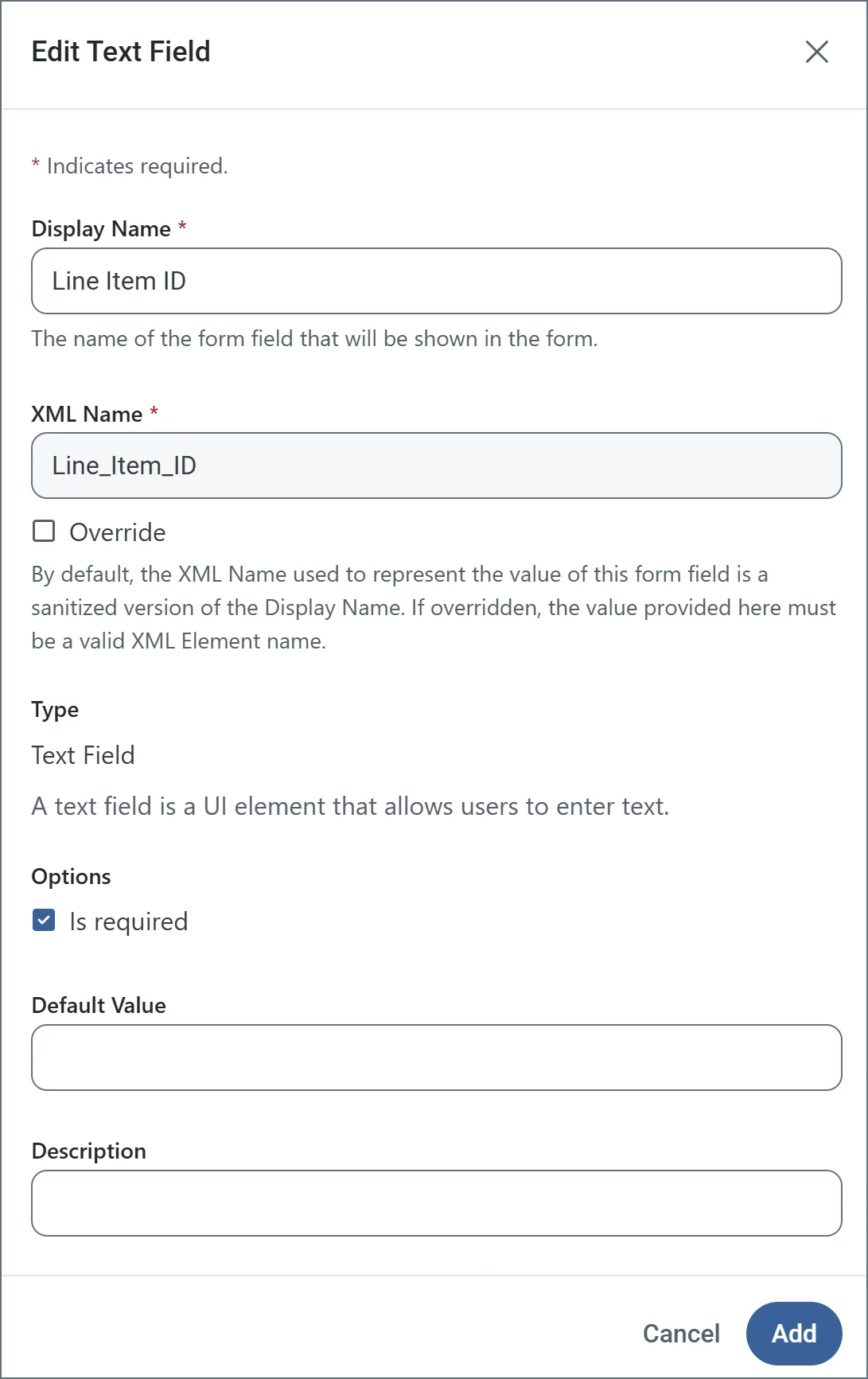
2. Enter a **Display Name** (for example, Line Item Id). By default, **XML Name** is populated, but you can use the **Override** checkbox to supply a different name.
3. Use the **Is required** checkbox to specify whether the field is mandatory.
4. The other options vary based on the [form field type](#form-field-types). The following example shows a text field being defined. When you are finished defining the field, click **Add**.
### Adding Fields
*Fields* are the basic unit of input for the form.
To add a field:
1. Drag an object from the **Form Fields** section into your section or detail table.
2. Enter a **Display Name** (for example, Line Item Id). By default, **XML Name** is populated, but you can use the **Override** checkbox to supply a different name.
3. Use the **Is required** checkbox to specify whether the field is mandatory.
4. The other options vary based on the [form field type](#form-field-types). The following example shows a text field being defined. When you are finished defining the field, click **Add**.
To edit a field, click the link to its name, or the ellipses to the right of the name.
To remove a field, click the ellipses and choose **Remove Instance**.
Drag and drop fields in a section or detail table to reorder their position in the form.
 ## Submitting Form Data
After you create a form, users access the Form connector's web endpoint and submit data using the form.
For fields in the main form, users simply enter the values that correspond to the labels on the form (which are taken from the name of the fields that you created).
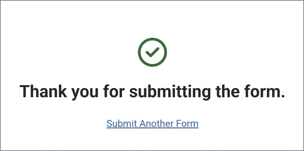
Users can add rows to the detail table by clicking **Add Row**. Once a user enters all their data, they click **Submit** to submit their data. If the submission is successful, a message similar to the following appears.
## Submitting Form Data
After you create a form, users access the Form connector's web endpoint and submit data using the form.
For fields in the main form, users simply enter the values that correspond to the labels on the form (which are taken from the name of the fields that you created).
Users can add rows to the detail table by clicking **Add Row**. Once a user enters all their data, they click **Submit** to submit their data. If the submission is successful, a message similar to the following appears.
 When a user submits a form, the form data is pushed to the **Transactions** tab. The output is an XML file that contains the following structure:
```xml theme={null}
When a user submits a form, the form data is pushed to the **Transactions** tab. The output is an XML file that contains the following structure:
```xml theme={null}